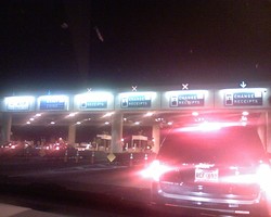
While there's nothing wrong with toll roads, there's definitely something wrong with many toll booth operations. Requiring traffic to slow from expressway speeds to zero introduces a whole range of problems, since different drivers don't accelerate and decelerate at the same pace. And when traffic designers unwittingly introduce additional confusion into the equation, they're just asking for trouble. Note this photo from a toll plaza. Drivers are being asked to determine, from a distance, into which lane they should drive. The far left is for those with electronic transponders (often called something like "EZ Pass"). The next lane is for those with exact coins. The others are for drivers without exact change, or those who need receipts.
It's not bad enough that the signs are relatively small -- the situation is made worse by including a three-lane gap between "exact coins" and "change/receipts". Three lanes right in the middle -- all closed. That causes anyone who makes a mistake (or who can't read the signs from a long-enough distance) to have to make a dramatic swing across a wide gap of road, cutting into lanes that already have backups.
Worse yet, the only way a driver would know that the three lanes in the middle are closed is to see the red "X" at the top of the sign. You probably find them hard to read clearly in this photo, just as they were in real life. That's because the lane open/closed indicators are surrounded by a lot of other bright lights, and the closed lanes remain brightly lit, even though they're not available for traffic. Anyone who's traveled through a well-lit nighttime work zone knows it's hard for the eyes to adjust from dark nighttime highways to bright light. Asking those drivers to then use bright lights to make decisions that could require crossing three lanes of closed toll booths is nothing more than a recipe for trouble.
This awful approach to signaling drivers where to pay their tolls could be improved by (at the very least) closing the gap between the open and closed lanes, making the open/closed lane indicators wide strips of red or green light (instead of a single "X" or an arrow), and dimming the lights for those lanes that aren't open. By definition, the people using an expressway are oftentimes from out of town and not familiar with local geography. Why make it harder and more dangerous for them to use toll roads than it needs to be?
