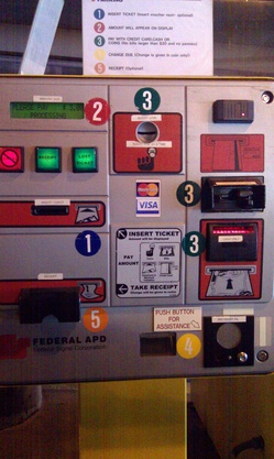
In how many ways does this automated payment machine in a downtown parking ramp fail to make the grade? Let us count just some of the ways:
- No sensible person starts looking for step #1 in the middle of something.
- The first-time user probably doesn't expect to be forced into a round-robin experience looking for the next step.
- There is no step number three. There are steps 3, 3, and 3.
- One of which, by the way, requires that the user insert the credit card upside-down, with the magnetic strip facing up.
- The button to request a receipt is between steps 1 and 2 -- but the slip pops out under step #5.
This is, quite possibly, the worst-designed automatic payment terminal on the planet. It should be obvious from the need for a five-step instruction guide (seen on top of the machine) that whomever designed the machine put next to no thought into how the first-time (or even the 101st-time) user would expect the machine to communicate in a clear, concise fashion. If something as simple as paying a parking fee requires following a round-robin layout like this, then something is totally wrong with the design. A parking payment kiosk needs to be quick, intuitive, and easy to use -- or else it's just a way to create traffic jams behind the confused user trying to pay his or her way out.