Brian Gongol
Many social, political, and religious organizations send out mass e-mails to their members. Unfortunately, many of those e-mails are ineffective. Here are some tips for making those messages more effective:
Limit the number of calls to action
Most people look at an e-mail message only once. That means that each e-mail should contain only one call to action, whether it's a request for an RSVP or a reminder to add upcoming events to a calendar or a plea for volunteers. An announcement containing too many calls to action (even just two or three) will get vastly less response than one that contains a single call to action.
Think in terms of the junk mail you receive through the postal service. Whether it's a fundraising letter for a charity, a letter from a political candidate, or a solicitation for a magazine subscription, effective bulk mail always limits the call to action to just one thing: "Send us your money", usually with a simple postcard enclosed for you to promise to do exactly that.

In the above example, a group e-mail was sent that included at least three different calls to action (marked in orange). You can see what a lengthy message it was, and by zooming out, it becomes obvious that if the recipient stopped to respond to each of those calls to action, he or she would have very little chance of remembering anything about the rest of the message. Every time the receipient has to stop and take action to respond to the e-mail, he or she becomes significantly less likely to return to where he or she left off.
When delivering lots of information, direct the user to a web page instead
People read their e-mail on a variety of devices: Text-only webmail services, graphics-ready desktop mail clients, handheld devices, and cell phones. That means that whatever formatting you do in the e-mail to help make it more readable (like colored fonts, bold, underlining, and so forth) will only be visible to some recipients. Others will see only a plain-vanilla version of the text without any ornaments.
When trying to deliver lots of information (like a calendar update), direct the users to a web page where you can have much greater control over the formatting.
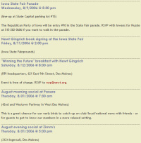
Well-formatted text (like the above) provides helpful visual cues that make the information easier to digest. Even without being able to read exactly what the text above says, you can clearly see where items start and stop (between the lines), which items are more important than others (big, colored text), and that some details involve action by the user (hyperlinks in red). The above is actually a screenshot of the web-formatted version of the e-mail critiqued in the previous section.
While it is possible to put some of this formatting into e-mail, there's absolutely no way to make it appear consistent across browsers, devices, and mail services. Web pages, on the other hand, render reasonably consistently across devices and are easy to change.